


Topic: Build helper - icons
|
SirVer
Joined: 2009-02-19, 14:18
Posts: 1445  One Elder of Players Location: Germany - Munich |
Posted at: 2011-04-26, 10:31
The new fish is a bit to dark and hard to recognize, imho. About the resource graphics: I like them a lot as they are more toned down than the originals. Note though, that in the editor it would be great if the mine symbol and the resource symbols could stack over each other without interfering. I could for example imagine the resources not being piled up in a pyramid, but instead layouted in a ring so that if you enable build help, the ring goes around the handle of the mine.png symbol so that the mine.png stays well visible. Was that comprehendable?  Top
Top
 Quote
Quote
|
|
fraang Topic Opener
Joined: 2010-02-15, 12:13
Posts: 239  Widelands-Forum-Junkie |
Posted at: 2011-04-30, 22:59
Ok I have tried to make this "ring of ressiurces". :D
And a new/improved fish icon (and the old to compare):
Top
Quote
|
|
SirVer
Joined: 2009-02-19, 14:18
Posts: 1445 One Elder of Players Location: Germany - Munich |
Posted at: 2011-05-01, 09:48
I dig the ring... could someone post a screenshot with it inside the game?
Top
Quote
|
|
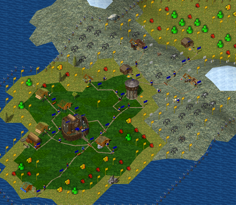
fraang Topic Opener
Joined: 2010-02-15, 12:13
Posts: 239 Widelands-Forum-Junkie |
Posted at: 2011-05-05, 00:35
Update! Now ingame screenshot of the new resource icons:
Btw. there is a new swamp terrain texture from me. Changed the hue to be more swamppy xP. For discussions please open a new thread.
Top
Quote
|
Astuur
Joined: 2009-02-28, 09:08
Posts: 733 One Elder of Players Location: Frankfurt / Germany |
Posted at: 2011-05-05, 06:18
Why do you dissolve the ring into 8 individual bullets? My personal opinion is, that it all looks too crowded, too dense. Already with the current state of things, the resource icons disturb Being no programmer, I apologize for all my suggestions that imply undue workload and for other misjudgements due to lack of expertise or relevant skills.
Top
Quote
|
|
fraang Topic Opener
Joined: 2010-02-15, 12:13
Posts: 239 Widelands-Forum-Junkie |
Posted at: 2011-05-05, 12:14
I had in mind to display the different levels of the resources with different amount of spheres, but the filled double contour would be also possible. Note that there are only a few different levels displayed. I think around 6 or 7.
Making the icons for the resources smaller let them vanish behind the building icons. This is the reason for the big icons. The fish could be smaller but why? There is enough space.
Yeah that would be cool. Like the build helper "layer". EDIT: Another way to display the resources could be to make a small pile or lump in front of the mine icon. For the water resource we could make drops instead of spheres. Edited: 2011-05-05, 12:19
Top
Quote
|
|
Astuur
Joined: 2009-02-28, 09:08
Posts: 733 One Elder of Players Location: Frankfurt / Germany |
Posted at: 2011-06-29, 06:50
Coming back to the question of transparancy of the build help icons. Being no programmer, I apologize for all my suggestions that imply undue workload and for other misjudgements due to lack of expertise or relevant skills.
Top
Quote
|
Marcelo_do_Pagode
Joined: 2011-07-23, 17:59
Posts: 36  Pry about Widelands Location: Brazil |
Posted at: 2011-08-15, 12:10
The "small pile" was the way in at least one of the Settlers franchise and it worked really great in my opinion. Marcelo do Pagode
Top
Quote
|
|
ajasio
Joined: 2009-10-01, 01:42
Posts: 5  Just found this site |
Posted at: 2012-01-22, 13:44
hm, I think, it looks better with a small light shadow. here my example: http://hackbird.siedler3.net/widelands/Image2.png generally I think, everything of the UI, which comes over the "playfield" it ought to have a shadow, to differentiate from the "playfield". ...just my opinion. Edited: 2012-01-22, 13:49
Top
Quote
|
chuckw
Joined: 2010-03-15, 15:23
Posts: 945 One Elder of Players Location: New York - USA |
Posted at: 2012-02-16, 15:03
There has been a discussion about the buildhelp icon for port buildings in Bug Report #892826 and I thought I'd open it up to the rest of the community.
So, I propose to change the color of Peter's icon What do you think? Does anyone have another idea you'd like to share? Edited for clarity. Edited: 2012-02-16, 15:05
I see little people.
Top
Quote
|


